The question
How does a resource inventory become a supply curve?
Learning objectives
- 01Build the logic of a resource assessment from gross inventory to delivered supply.
- 02Read a supply curve without treating it as a forecast.
- 03Track provenance and scenario assumptions for every filter.
Core explanation
A resource assessment begins with a documented inventory, then applies eligibility, sustainability, recovery, quality and current-use filters. Spatial units are linked to collection, preprocessing, storage and transport assumptions. The result is a scenario-specific estimate, not an inherent property of the territory.
A supply curve orders increments of resource by a defined cost—often farmgate, roadside or delivered. The horizontal axis is cumulative quantity; the vertical axis is marginal cost. The curve changes when fuel prices, collection technology, safeguards, moisture, scale, geography or competing demand changes. Average cost and marginal cost answer different questions.
Good assessments publish data vintage, spatial resolution, unit conventions, dry/wet basis, exclusions, cost boundary and uncertainty. The DOE Billion-Ton studies illustrate how national assessments evolve as resource classes, economics, market maturity and scenarios are updated.
Key concepts
Supply curve
Cumulative resource quantity ordered by a stated marginal cost boundary.
Delivered cost
Cost at the user gate including relevant collection, conditioning, storage and transport.
Data vintage
The observation or release date represented by a dataset.
Marginal cost
Cost of mobilizing the next increment, not the average of all supplied units.
Visual explanation
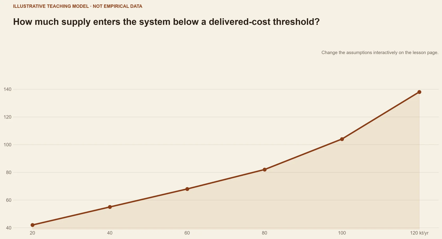
Explore · supply curve builder
See why increasing quantity usually brings new locations, qualities and costs.
Compare three procurement cases; inspect which resource tranche enters next and why.
iIllustrative learning model — values are not scientific results or forecasts.
Local core
Nearby, higher-quality resources enter first.
- Supply
- 40 kt/y
- Delivered band
- €55–75/t
Worked example
Building a three-step supply curve
Three zones offer different sustainable quantities, moisture and transport distances.
- 01
Convert every quantity to the same dry-mass and quality basis.
- 02
Calculate a consistent delivered-cost boundary for each zone.
- 03
Order increments by cost and show uncertainty bands rather than one precise staircase.
Changing the facility location or sustainability filter can reorder the same resource zones.
Case file
Assessing the Techno-Economic Feasibility of Bamboo Residue-Derived Hard Carbon
- Why it is here
- The public case connects a biomass-derived product route with economic performance assumptions.
- What to inspect
- Inspect how feedstock cost and quality enter the economic boundary.
- Limitation
- The published feedstock context is not a regional supply-curve study.
Tool in context
BioenergyKDF
- Use it for this task
- Inspect resource estimates, locations and source metadata before building a curve.
- Limitation
- Datasets differ in date, resolution and assumptions and must be reconciled before use.
Inputs, outputs & scope
- What it is
- A discovery portal for U.S. biomass resource data, analyses and bioenergy tools.
- Problem it addresses
- Where can analysts find documented resource and pathway data?
- Inputs
- Search terms, geography, resource classes and analysis needs.
- Outputs
- Datasets, metadata, reports and links to analysis tools.
- Typical applications
- Resource assessments, supply curves, scenario framing and provenance discovery.
Core references
- U.S. Department of Energy (2024). 2023 Billion-Ton Report: An Assessment of U.S. Renewable Carbon Resources.https://doi.org/10.23720/BT2023/2316165 ↗
- Ericsson and Nilsson (2006). Assessment of the potential biomass supply in Europe using a resource-focused approach.https://doi.org/10.1016/j.biombioe.2005.09.001 ↗
Further reading +2
- Oak Ridge National Laboratory / U.S. Department of Energy (2026). Bioenergy Knowledge Discovery Framework.Open source ↗
- Welfle, Gilbert and Thornley (2014). Increasing biomass resource availability through supply chain analysis.https://doi.org/10.1016/j.biombioe.2014.08.001 ↗
Knowledge check
Key takeaway
Resource potential is a documented scenario output; supply curves make quantity–cost trade-offs visible but do not predict adoption.
A published supply curve is a permanent and location-independent statement of available biomass.
Inventory provenance, filter sequence, cost boundary, units, geography, scenario year and uncertainty.